Packaging design - What makes the product successful
Packaging not only has a protective function but can be a way to advertise products, helping to convey the brand's message to consumers and attracting customers among thousands of other products.
There are many styles of packaging for each type of product, below are the latest designs for food product in the last semester of Graphic Design students - LCDF-Hanoi.
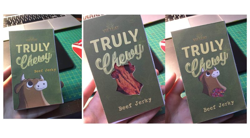
Sample packaging set for Pham Ha An's beef and chicken jerky.
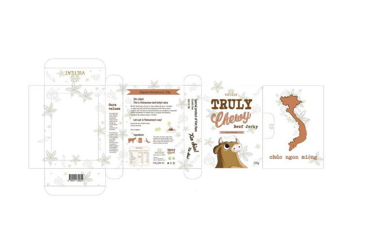
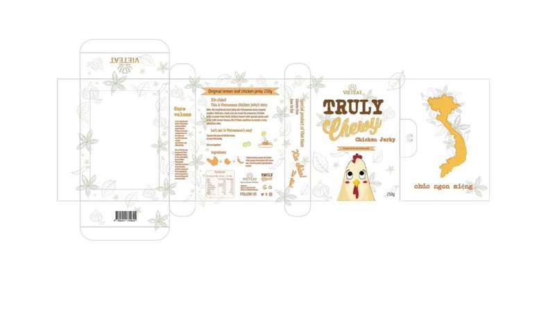
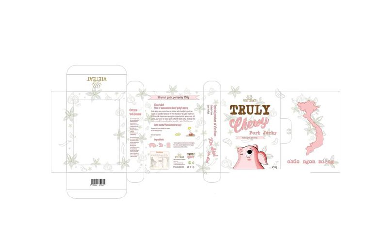
Different from the main stream packaging, this light and gentle color package make people feel safe to use. Moreover, using a large typeface makes the product looks confident, modern and eye-catching.
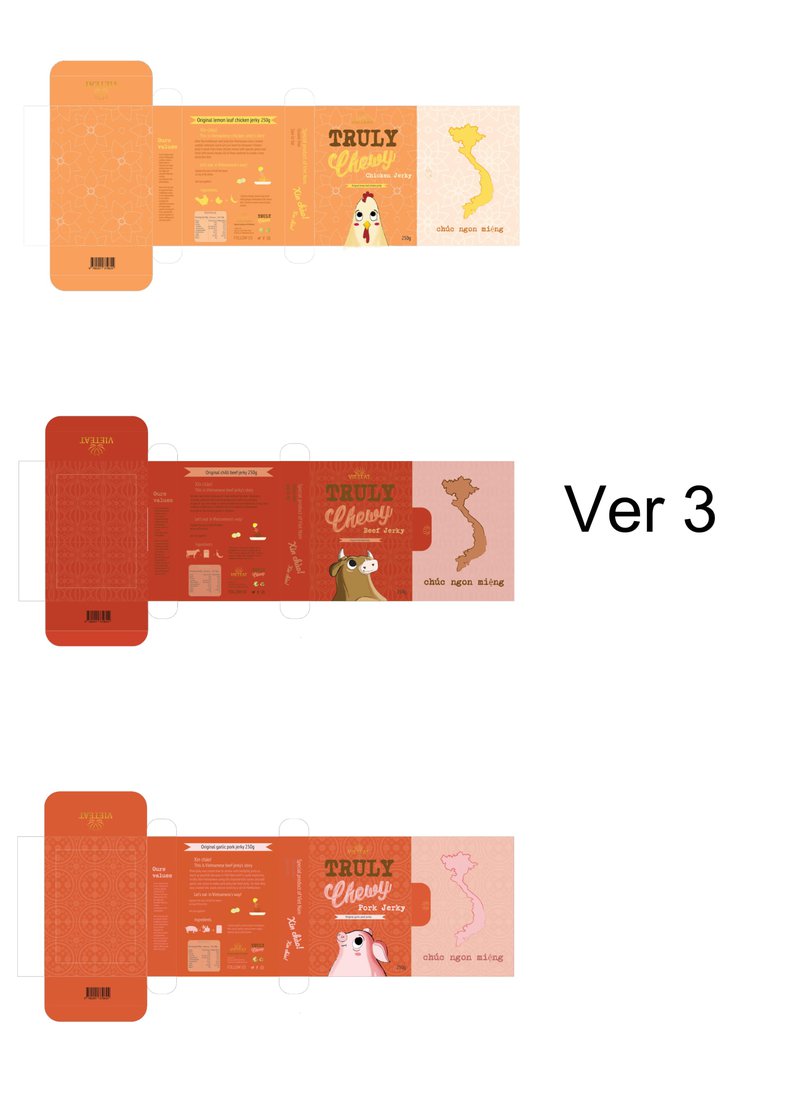
A different version which show different flavors through the use of color and image.
After a lot of ideas, these are final packaging designs which were used for Ha An ’s packaging.
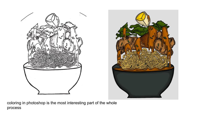
The drawings and colors show the dynamism and youthfulness of products inside packaging by Ngan Le.
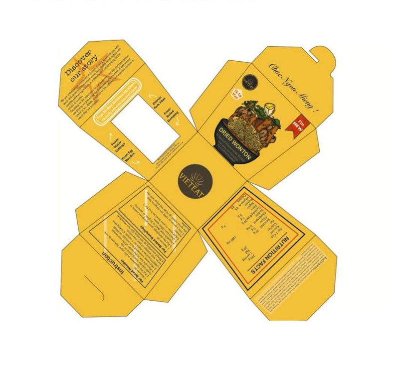
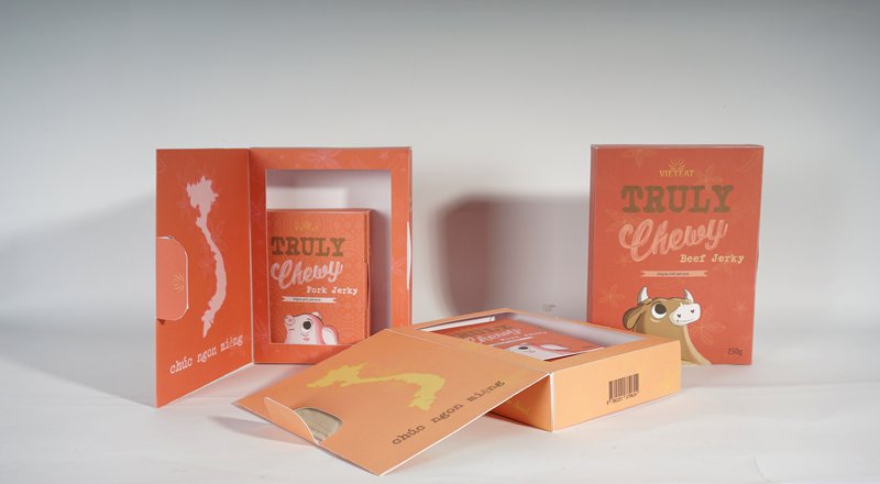
The attractive and eye-catching golden tones and the bold drawing make the product stand out so shoppers at first glance will be attracted and wish to buy it.
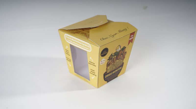
Photos of the finished Packaging.
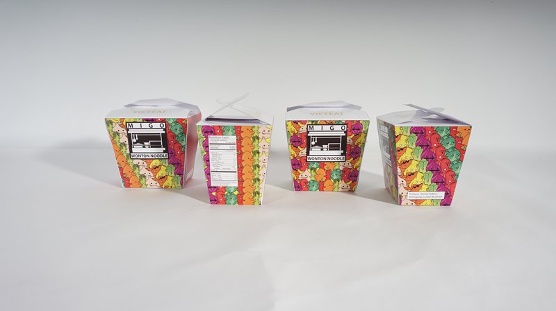
Ho Tien Tai used illustration of vegetable, characters to create a cheerful and colorful package that represents Vietnamese food in a modern way. The approach has overcome the common use of using direct photo of product to describe the contents of the package.
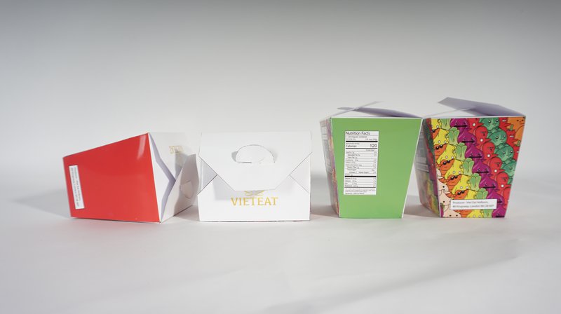
Inspired from the colors taken from real products and then developed with graphic and digital create better visual effects: The black and white logo emphasizes the image of the advertised product.
Through a number of design products, it is undeniable that packaging is really important when commodities are increasingly diverse and customers demand is higher. Designing beautiful packaging is not enough, it also have to stimulate purchasing power and create a meaningful value to customers. So researching and finding ideas for each type of packaging is a job that requires a lot of creativity and intelligence.
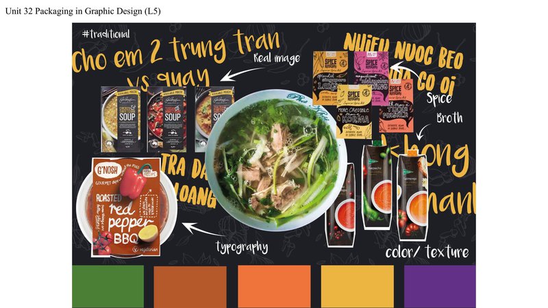
Le Trieu Vi designed packaging for products such as Chicken Noodle, Bún ốc, Bun cá.
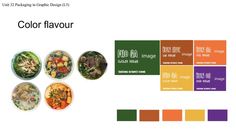
For each type of ingredient that makes up diverse food, the author chooses different colors, showing the color characteristics of the dish.
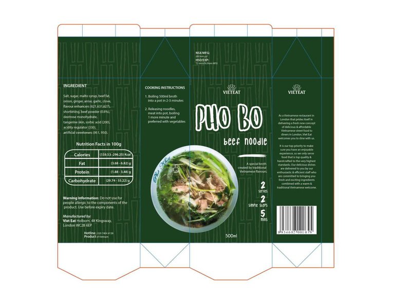
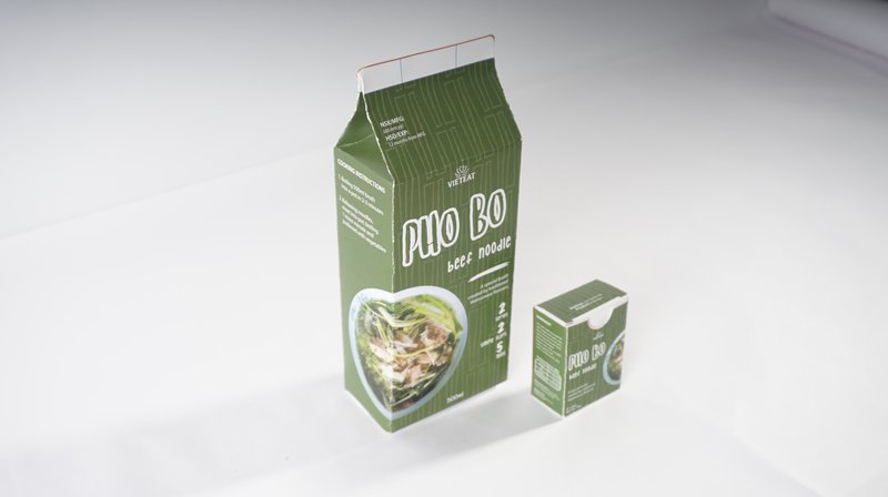
The beef noodle soup with green tones expresses the attractiveness of onion, coriander etc, Le Trieu Vi cleverly combined the hand drawn Sans Serifs font to create a soft, gentle image which suitable for the characteristics of this dish, which attract people to look at the product.
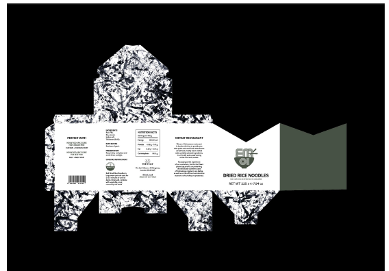
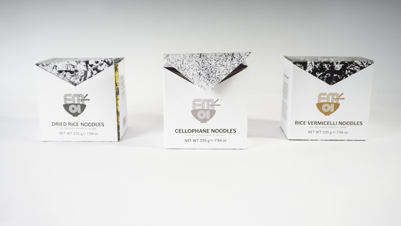
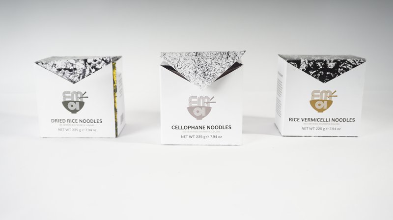
This is the packaging design for Vietnamese rice noodles. Inspired from the color of rice, Khanh Huyen uses white as the main pigment of the box.
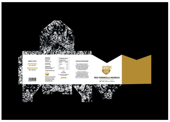
Packaging design for potato noodles. This product has the main ingredients from potato starch so the student uses the color of potato peel as an inspiration for her design.
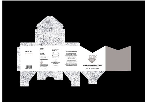
Design packaging for dry noodles made from cassava starch, so the student uses the color of this food for designing.
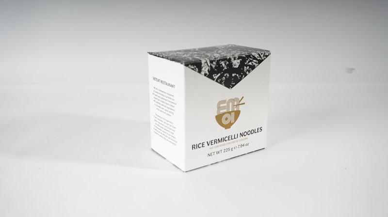
Especially, the pattern on the box is inspired from the hand-made paper noodle that the student made it by herself.
Photos of the finished Packaging.
LCDF.


