Hometown Symbol Design Competition: So many impressive designs, so difficult to chose the winner
- hang
- Ngày 18 tháng 4 năm 2017
Can you imagine what Sai Gon looks like in a rubik cube, Bien Hoa in a pomelo or Long An is as a beautiful and gentle girl?
Many symbols of cities in Vietnam are designed by young people who have excellent drawing skills. Who will become the winner in the second season of the “Vietnam – where I live” design contest?
Let’s look at symbols along our country which create challenges for the “Vietnam – where I live’’ contest’s judges!
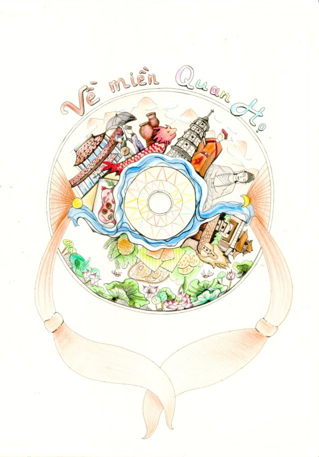
Insprired from a “Quai Thao” hat of “Quan Ho” girls, Nguyen Van Cuong (b.1995) skillfully included Cau bridge so that it looks like a silk on a “Quai Thao” hat. A religious architectural monument and a traditional ancient village is also represented. Moon and sun are included to symbolize the love of the Kinh Bac people.
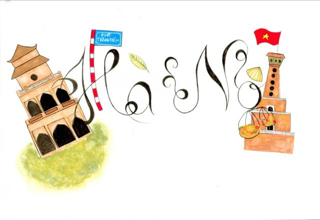
Ancient and modern Hanoi through the young eyes of Ngo Minh Anh (b.2000).
Between the Turtle Tower and the Flag Tower you can see the shoulder pole and hangers and the familiar Conical Hat which protects the working women from the sun and rain.
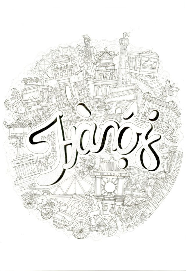
Here is another picture of Hanoi by Khuat Khai Hoan (1998) who was born and grew up in the Old Quarter. If you come to Hanoi, he suggests that you should take a cyclo to enjoy the beauty of our capital. You will be surprized at the crowded streets, however Hanoi is very elegant and gentle.
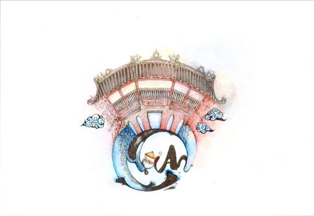
The simple design of Nguyen Phuoc Kiet (b.1995) places the emphasis on the famous bridge that is the center of interest for most visitors. He has designed the Hoi An word to include specialties such as Quang noodles, a chili and “bai tho” hat.
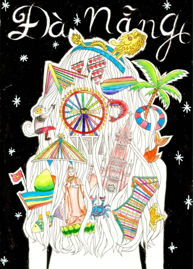
The design of Do Nam presents Da Nang as a 20 years-old beautiful girl. Her hair shows the romantic Han river.
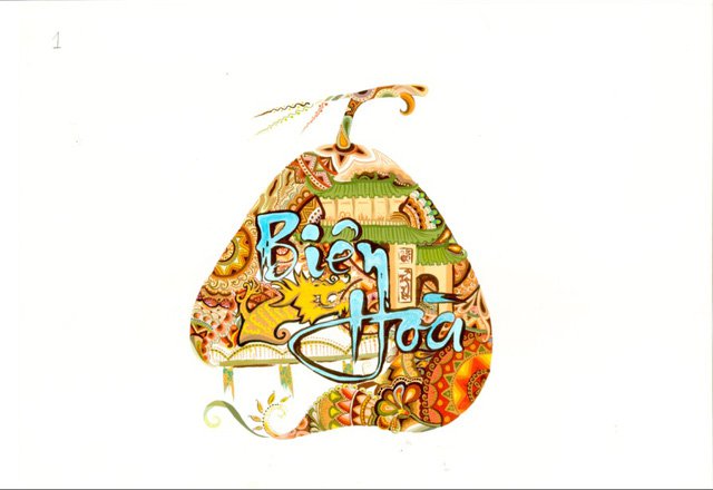
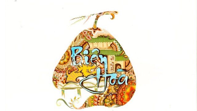
Inspired from the poem “Bien Hoa” - the land of green skin pomelos, there are beautiful girls selling pomelos, Phan Thi Nhu Quynh (b.1996) designed Bien Hoa with famous places namely Tran Bien Temple, Ghenh bridge, Buu Long tourist area, etc. in the shape of famous fruit: pomelo from her hometown.
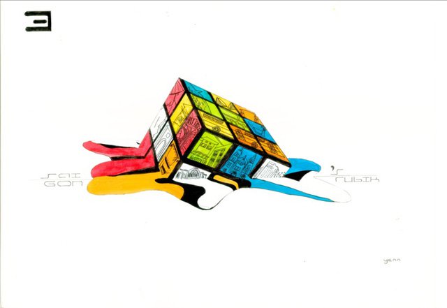
With a new idea, Sai Gon is colorfully designed as a Rubik Cube. If you want to understand totally about Sai Gon, you will need to discover from different angles, it seems to be contrary but also harmonous. With Do Thi Ngoc Yen (b.1993), Sai Gon is very small but sometimes we can get lost.
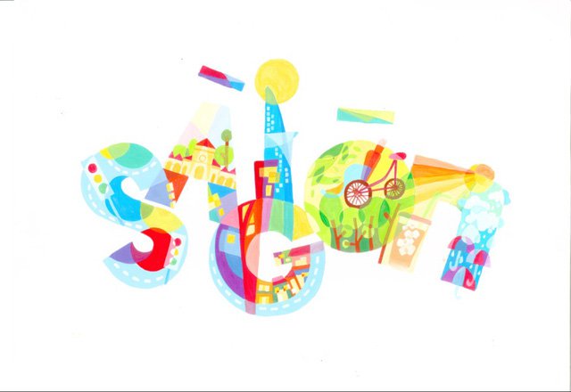
On the contrary, the symbol of Sai Gon is freely designed with typical images such as roads section with many bends, tree lines, cold milk coffee, old houses, towers, sunny and rainy seasons, etc. which are colorful presented. Le Phan Thanh Hoang loves Sai Gon because it is young, active and has a diversity of culture!
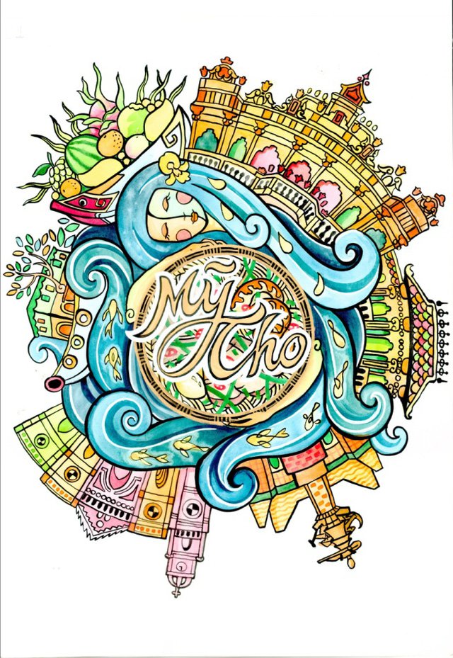
Prosperous communities in My Tho city are surrounded by the gentle Tien river which suppies alluvium this city - the land of love. The symbol has been designed as a mother hugging her daughter. (Picture of Pham Thien Phu b.1994)
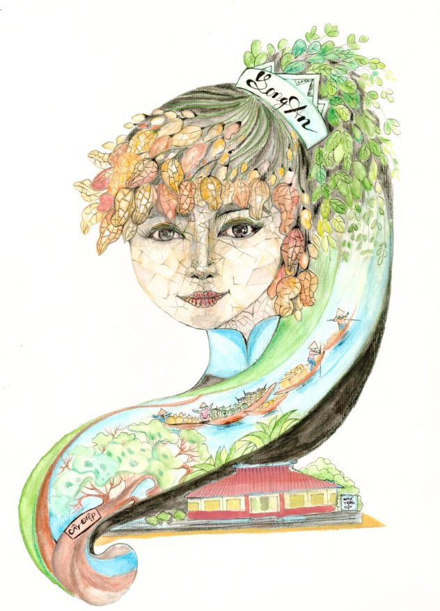
The special techniques used to create patterns by Tran Minh Pha (b.1999) are admired by many people. The blue color of Vam Co river mixed with the green of rice fields and peanuts designed in a symbol where Nha Tram Cot and the prosperity of Long An has been included in a girl’s long hair.
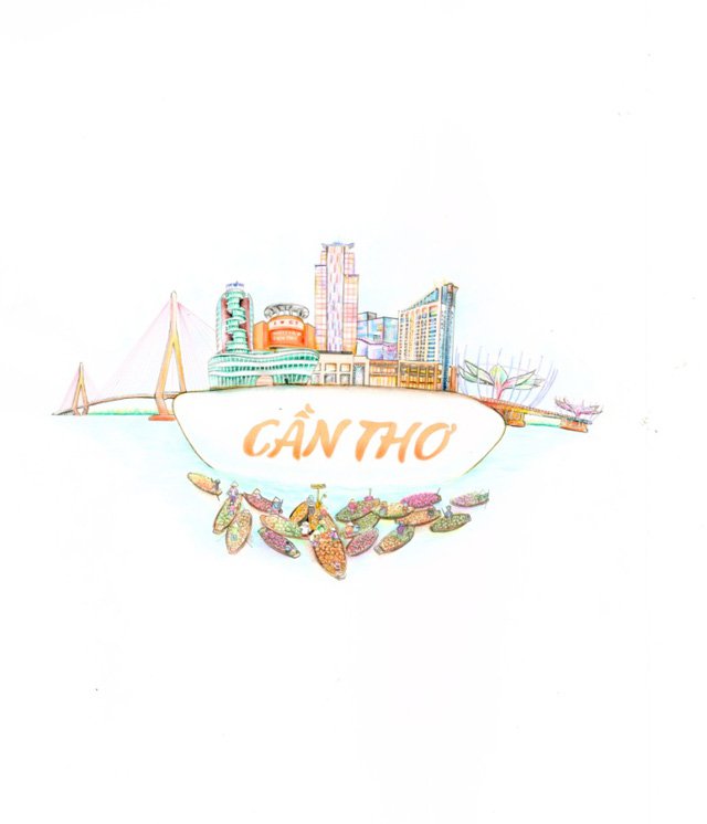
Can Tho is famous for white rice and pure water with floating markets full of famous fresh fruits, so that “if you come there, you will not want to go back home”. Tran Hoang duy (b.1996) wants to show his city of Can Tho is modern and active, but it still keeps the traditions of Cuu Long delta.
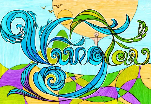
The waves of Vung Tau are the hometown’s symbol in the heart of Nguyen Thi Thien Thanh (b.1990). The sea is mixed with sun flowers and fields of grass which represents the name of Vung Tau.
The above works are typical images from nearly 500 designs submitted to Vietnam-where I live competition. Organizers are carefully reviewing and grading the designs, following this there will be an exhibition to present the best designs. Don’t forget to follow and vote for the design you love best!
Facebook: https://www.facebook.com/vietnamnoitoisong.

